Mastering the Realistic Chalkboard Effect in Photoshop: Your Ultimate Guide
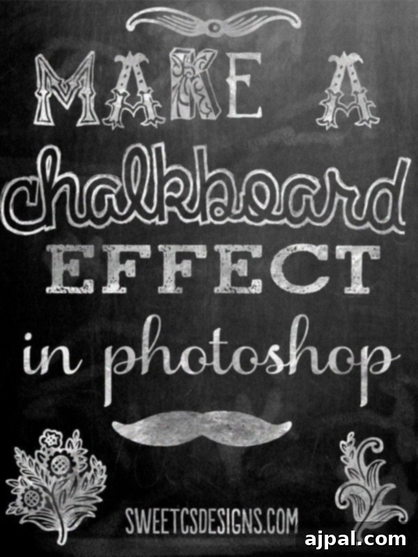
The timeless charm of chalkboard art has captured hearts and imaginations across various domains, from rustic home decor to stylish event invitations and engaging digital graphics. Its versatile, handcrafted aesthetic offers a unique blend of nostalgia and modern appeal, making it a staple in contemporary design trends. If you’ve ever admired the beautiful, seemingly effortless chalk designs and wondered how to recreate them digitally, you’re in the right place. This comprehensive guide will walk you through the process of crafting a truly realistic chalkboard effect in Photoshop, transforming ordinary text into captivating chalk art. We’ll explore essential Photoshop functions, provide valuable tips, and offer free downloadable resources to kickstart your creative journey.
Why the Chalkboard Aesthetic Continues to Inspire
The enduring popularity of the chalkboard trend is no accident. It evokes a sense of warmth, authenticity, and personalized touch that mass-produced items often lack. Whether used for a wedding sign, a daily menu board in a cafe, or a decorative wall print, chalkboard art offers:
- Rustic Charm: It brings a cozy, vintage feel to any setting.
- Customization: The ability to easily update and personalize messages.
- Versatility: Suitable for a wide range of styles, from farmhouse to modern minimalist.
- Nostalgia: A comforting reminder of school days or old-fashioned storefronts.
Learning to replicate this effect digitally not only empowers you to create stunning visuals for your personal projects but also equips you with valuable Photoshop skills applicable to countless other design tasks. This tutorial focuses on delivering the most realistic outcome, ensuring your digital chalk prints look as authentic as if they were drawn by hand.
Getting Started: Tools and Resources
To follow along with this tutorial, you’ll need access to Adobe Photoshop or Photoshop Elements. While a basic understanding of Photoshop is helpful, this guide is designed to be accessible to beginners eager to learn. We’ll be utilizing a few key resources:
- Chalkboard Background: A high-quality dark texture to serve as your canvas.
- Texture Overlay: A subtle pattern (like crumpled paper or parchment) to add realistic grain to your chalk.
- Eraser Brush: A specialized brush to simulate the fragmented look of chalk strokes.
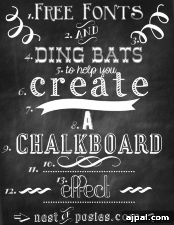
Don’t worry about finding these assets yourself – we provide free downloads for both the chalkboard background and the texture overlay at the bottom of this post! For those without Photoshop, creative alternatives exist. You might explore online graphic design tools or check out resources from talented designers like Kellie from Nest of Posies, who offers fantastic tutorials and font recommendations for creating chalk effects without advanced software.
Step-by-Step Tutorial: Crafting Your Realistic Chalkboard Print
Let’s dive into the core process. Each step is designed to build upon the last, culminating in a stunning, authentic chalkboard design.
Step 1: Set Up Your Canvas and Add Text
Begin by opening your preferred chalkboard background image in Photoshop. Alternatively, create a new document with your desired dimensions and then place the chalkboard image as your background layer. This forms the foundation of your design.
Next, select the Text Tool (T) and choose a font. While fonts with a naturally “chalky” or hand-drawn appearance can enhance the effect, this method works remarkably well with any font style. Experiment with elegant scripts, bold serifs, or playful sans-serifs to see what fits your vision. Type out your desired text onto the chalkboard background. Choose a white or off-white color for your text to mimic traditional chalk.
Step 2: Add a Textured Overlay for Subtle Grain
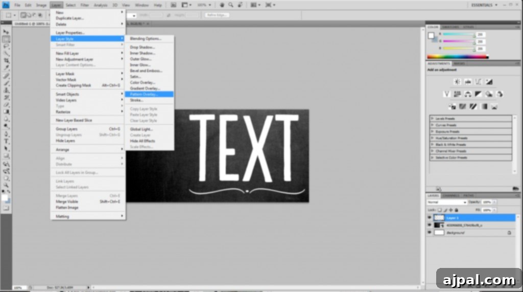
The secret to realistic chalk isn’t just color; it’s texture. To introduce a subtle, grainy surface to your text, we’ll use a pattern overlay. Select your text layer in the Layers panel. Then, go to the top menu and click “Layer” > “Layer Style” > “Pattern Overlay.”
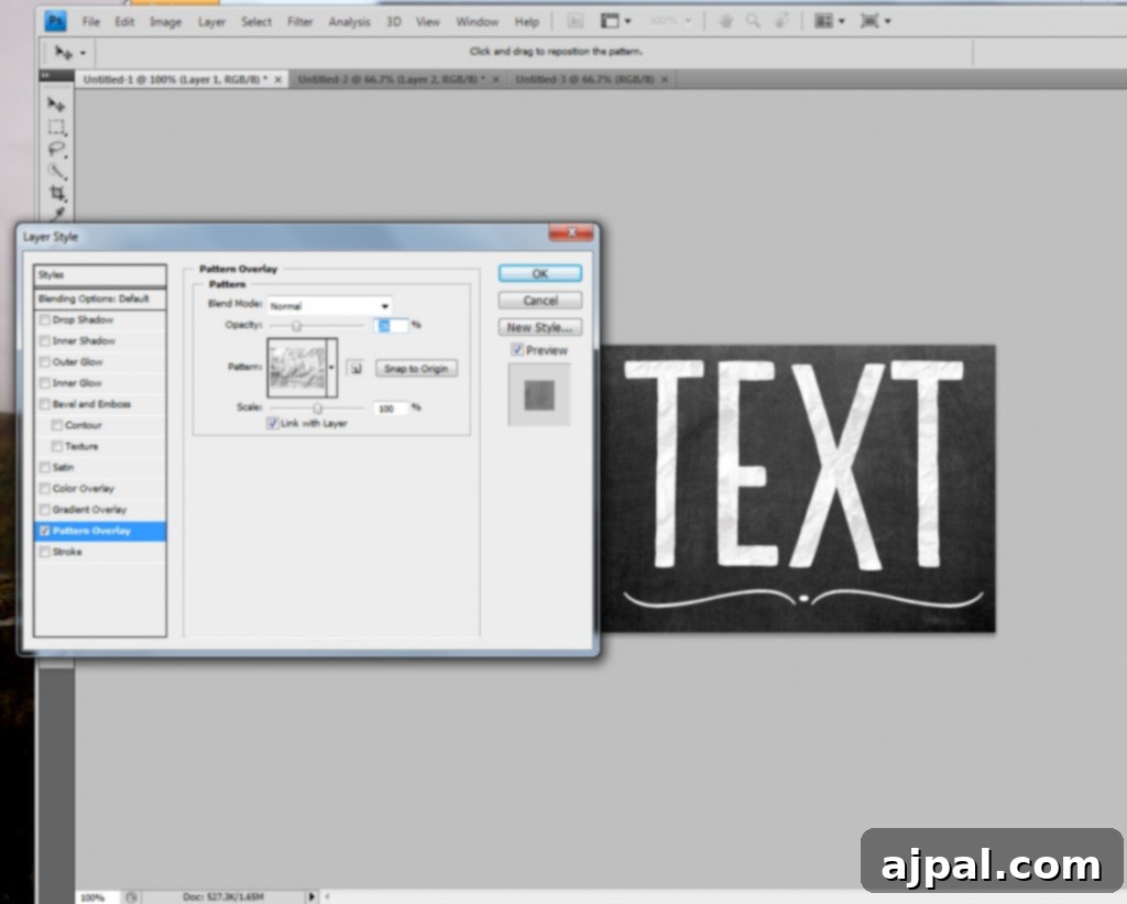
In the Pattern Overlay dialogue box, select a crumpled paper or parchment-style pattern. You can download our recommended texture overlay below. Once selected, it’s crucial to adjust the opacity. You’ll want a very light effect, just enough to hint at the texture without overwhelming the text. An opacity setting under 30% usually works best, but experiment with what looks natural for your chosen font and background.
Step 3: Introduce Grainy Noise for a Chalk-Dust Look
To further enhance the realism and simulate the slightly imperfect, powdery nature of chalk, we’ll add a subtle noise effect. Before you can apply noise, you need to rasterize your text layer. Right-click on your text layer in the Layers panel and choose “Rasterize Type.” Be aware that once rasterized, you will no longer be able to edit the text itself. If you anticipate needing to change the text later, duplicate the layer before rasterizing and hide the original.
With your rasterized text layer selected, navigate to “Filter” > “Noise” > “Add Noise.”
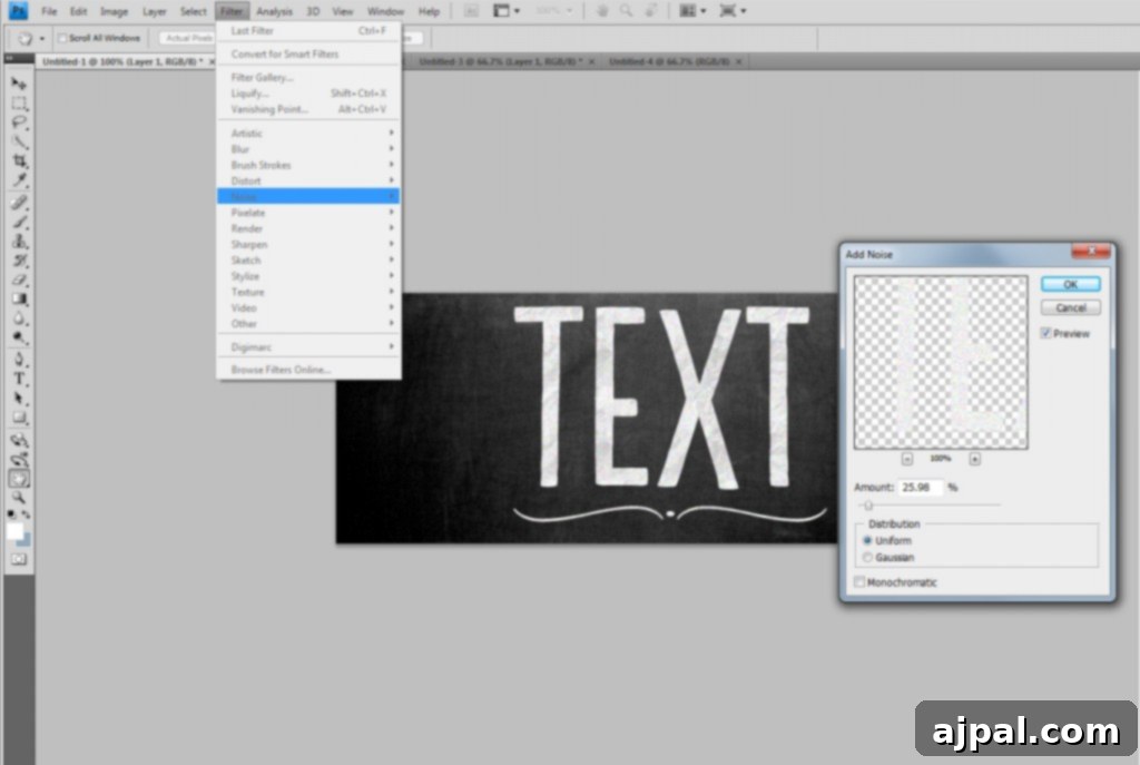
Similar to the pattern overlay, the amount of noise will depend on your font and desired look. Generally, an amount under 30% will produce the best results. Choose “Uniform” distribution for a smoother, more even grain, and you typically won’t need to select “Monochromatic Noise” unless you want a very specific black and white effect. Feel free to experiment with these settings to find what best complements your design.
Step 4: Sculpting with an Eraser Brush for Authentic Chalk Strokes
Now, we’re going to add even more texture to your text, making it appear as if individual chalk particles have been applied and worn away. This step is key to moving beyond a flat digital look to a truly hand-drawn aesthetic.
Select the Eraser Tool (E). For the brush type, choose a brush that mimics dots, speckles, or even a worn eraser. Many custom Photoshop brush sets include brushes perfect for this purpose, or you can create one yourself. (If you’re struggling to find one, a simple dotted brush can work wonders).
Crucially, set the eraser’s opacity to under 30% (a recurring theme for subtle, realistic effects!). With a soft touch, gently “swipe” or dab through different areas of your text. The goal is not to erase completely but to create slight imperfections and variations in the chalk. Focus on edges and areas where chalk might naturally fade or accumulate. Vary your pressure and brush size as you go to avoid a uniform, artificial look. Continue until you achieve a texture that suggests authentic chalk application.
Step 5: Adding Finishing Touches and Background Swipes
Your chalkboard text is already looking fantastic, but we can push the realism even further with some final touches. To mimic the subtle erased marks and residual chalk dust often seen on real chalkboards, we’ll use a paintbrush.
Select the Paintbrush Tool (B). Set your foreground color to white (or the exact color of your chalk). Use the same spackled dots or textured brush you might have considered for the eraser in the previous step. Again, set the brush opacity to under 30%.
Now, gently swipe and dab around the background, particularly in areas near your text, and even slightly over parts of your letters. Reduce and increase the opacity and brush size as you work to create varied, organic-looking marks. These subtle “erased” areas and specks of chalk dust add incredible depth and authenticity, making your digital creation indistinguishable from a genuine chalkboard piece. You can also experiment with a slightly darker color (like a dark grey) at a very low opacity to simulate areas where chalk has been cleaned but a faint shadow remains.
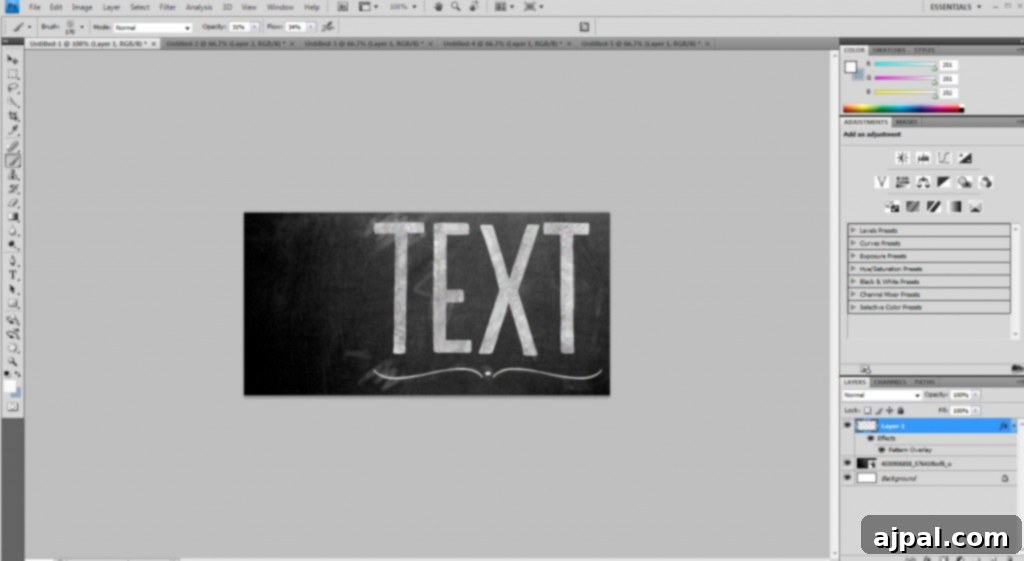
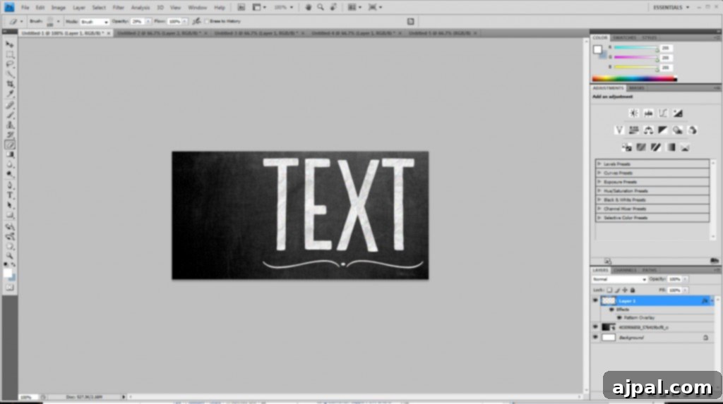
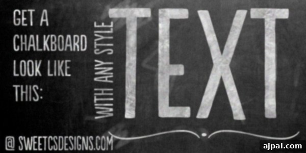
The white swashes in the example above are a bit more dramatic, demonstrating how you can use different brushes and opacities to add diverse looks, from subtle dust to distinct erasure marks. The key is to make it look organic and varied, just like real chalk on a board. What wonderful chalkboard image will you create first?
Advanced Tips for Ultra-Realism
While the steps above will give you an excellent foundation, here are some pro tips to take your chalkboard effect to the next level:
- Font Pairing: Combine a bold serif or script font for headings with a simpler sans-serif for body text to mimic diverse hand-lettering styles.
- Subtle Color Variation: Instead of pure white, try very light grays or even faint yellowish/bluish whites for your chalk color. Real chalk isn’t always perfectly pure white.
- Layer Opacity: Experiment with the overall opacity of your text layer. Sometimes a slightly reduced opacity makes the chalk feel more embedded in the board rather than just sitting on top.
- Inner Shadow/Outer Glow: For an even more dimensional look, add a very subtle inner shadow or outer glow (set to white with low opacity) to your text layer style. This can simulate the slight depth or bloom of real chalk.
- Brush Dynamics: If you’re using a drawing tablet, leverage brush dynamics (size jitter, opacity jitter) for even more natural variation in your eraser and paintbrush strokes.
- Multiple Textures: Don’t be afraid to stack multiple pattern overlays or add noise on a separate layer (clipped to the text) for nuanced texture.
Download Your Free Resources Here!
Ready to start creating? Grab these essential resources to follow along with the tutorial:
You can download your free chalkboard background here: [paiddownloads id=”10″]
And here is the texture overlay I used in the tutorial. To set it as a pattern in Photoshop, open the file, then go to “Edit” > “Define Pattern.” You’ll then find it in your dropdown pattern menu within Layer Styles!
For users with CS5, if the above files don’t work seamlessly, please try these alternative file extensions: [paiddownloads id=”20″] or [paiddownloads id=”21″].
Expand Your Photoshop Skills with More Tutorials
If you enjoyed mastering the realistic chalk text effect, you’ll love exploring other creative Photoshop techniques. Why stop at chalk when you can add a touch of sparkle to your designs?
Don’t miss my in-depth tutorial on creating beautiful glitter text in Photoshop here! It’s a fantastic way to add sparkle and glamour to your digital projects.
And if you’re looking to turn your digital designs into tangible creations, mastering printables is a must. Learn the secrets to designing professional-quality printables:
You can also learn how I use Photoshop to make printables here!
Conclusion: Unleash Your Inner Chalk Artist
With these straightforward steps and powerful Photoshop techniques, you now possess the knowledge to create stunning, realistic chalkboard effects that will impress and inspire. From personalized gifts to professional design projects, the possibilities are endless. Remember, practice and experimentation are key. Play with different fonts, textures, noise levels, and brush strokes to develop your unique style. We encourage you to download the free resources provided and start transforming your digital canvas into a captivating chalkboard masterpiece today. Happy designing!